Rapoo Europe: a refined identity and a flexible visual system
Rapoo is a global consumer brand with strong value for money, but limited brand recognition in Europe. While the products were competitive, the visual identity lacked consistency across markets and didn’t reflect the quality of what the brand was offering.
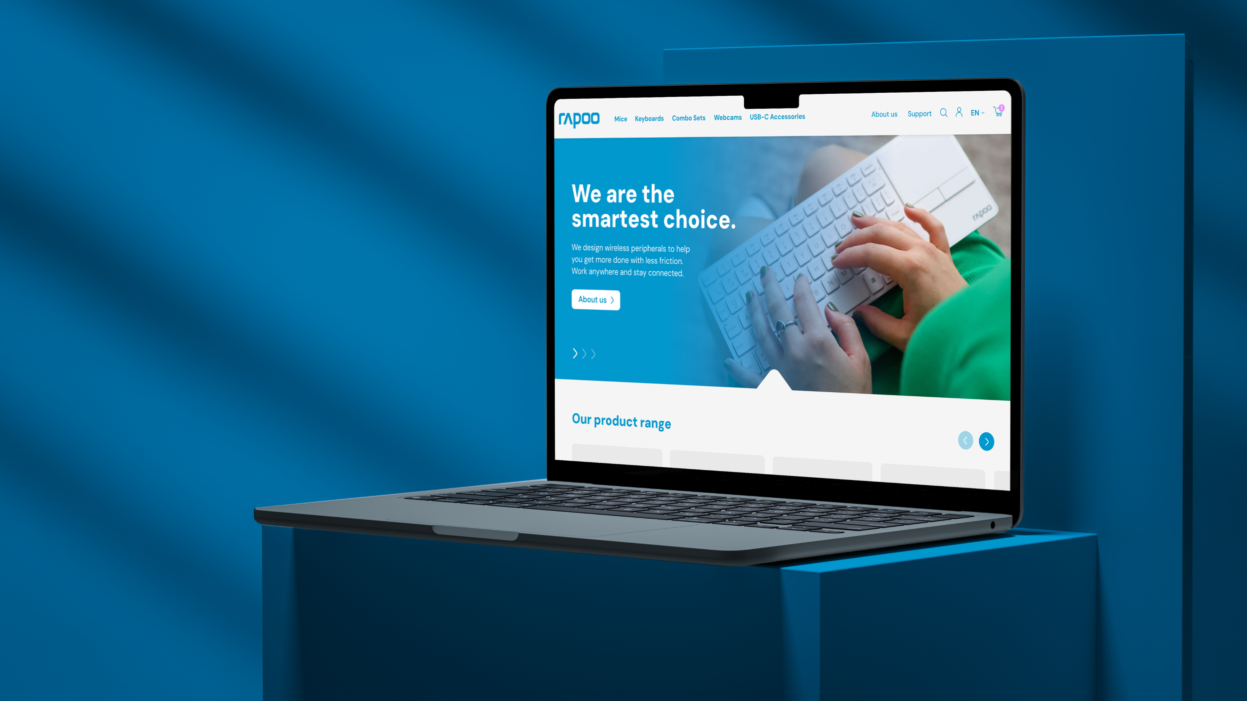
Working together with a brand strategist and a copywriter, the objective was to refine the brand positioning and develop a visual system that could increase recognition, improve consistency, and support a more confident presence in the European market, while keeping the existing logo and core assets in place.
The challenge
A key constraint was working within an existing identity that had grown fragmented over time: inconsistent branding across channels, no clear visual elements, and no design system for teams to create assets independently.

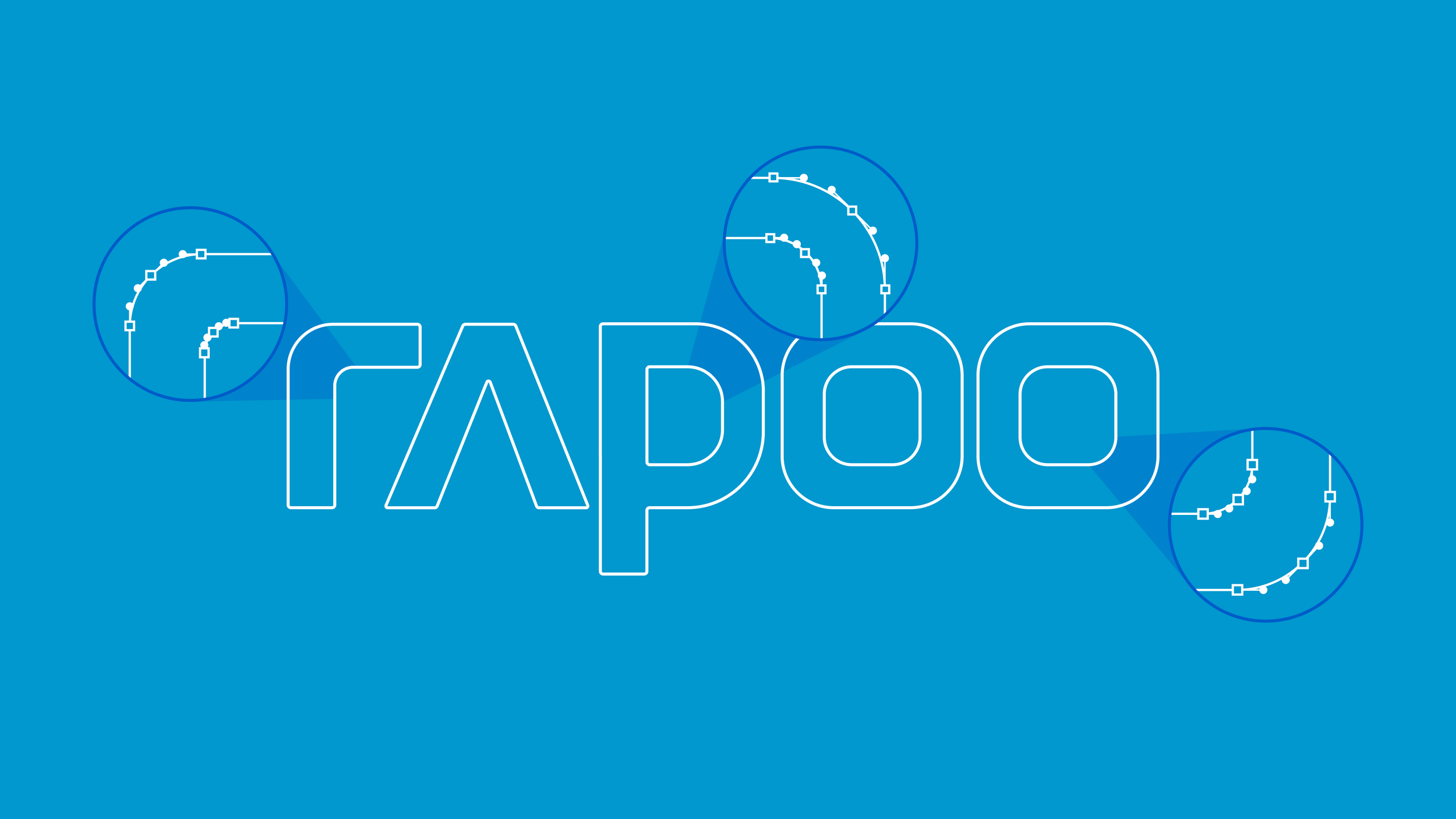
Tidying up the logotype.
As part of the refinement, I also addressed inconsistencies in the logo itself. Over time, multiple versions of the logo had been circulating across markets and materials, leading to subtle distortions in proportions, spacing, and usage. I consolidated these into a single, cleaned-up version and clarified basic rules for application, aligning it with the version used in HQ and other markets.
Saying less, saying it better.
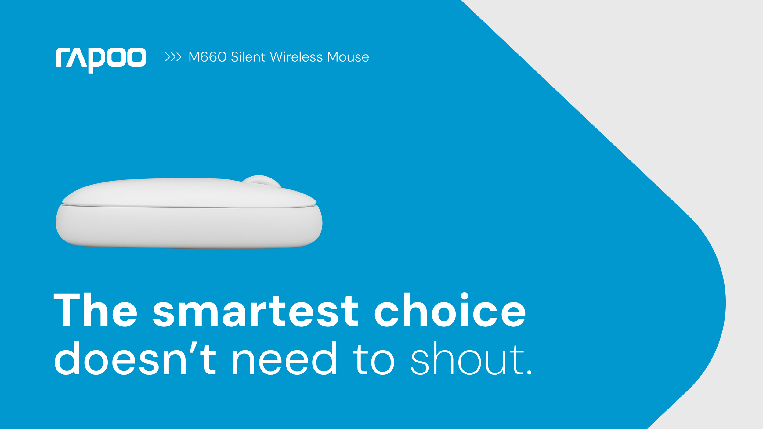
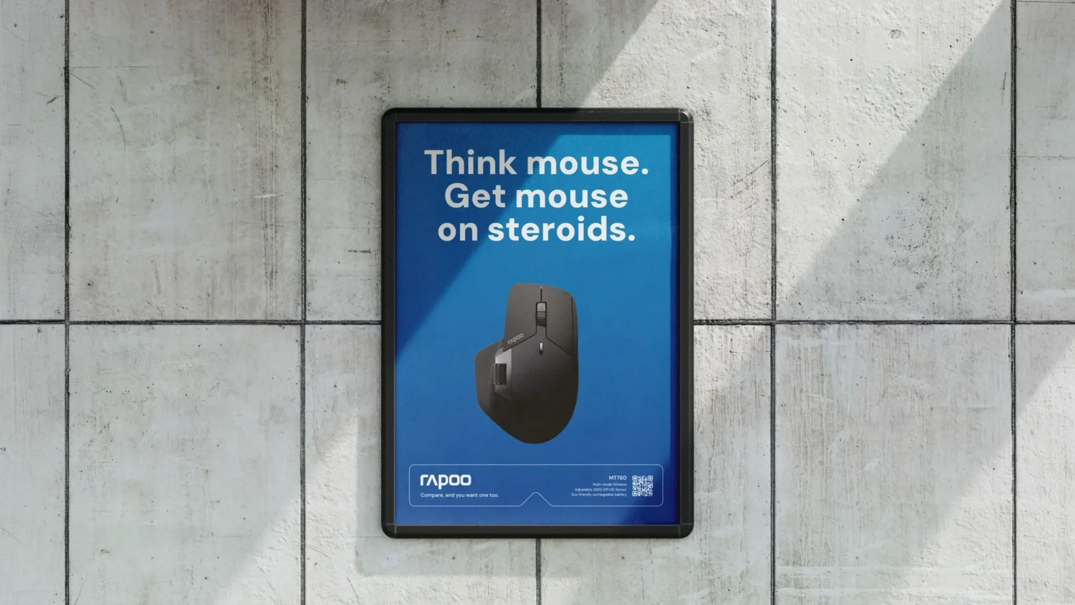
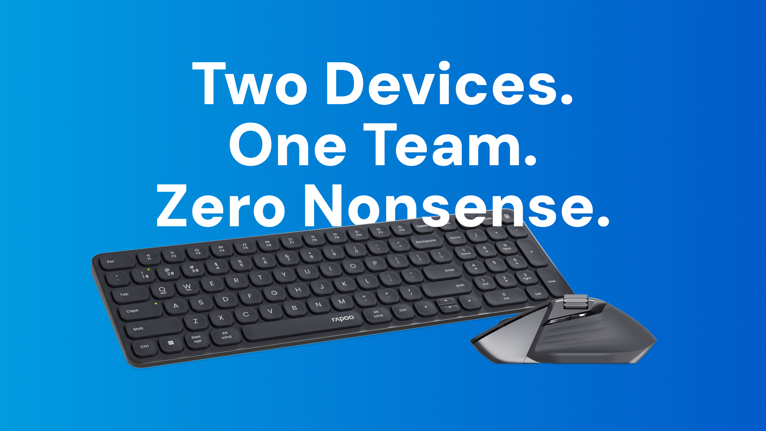
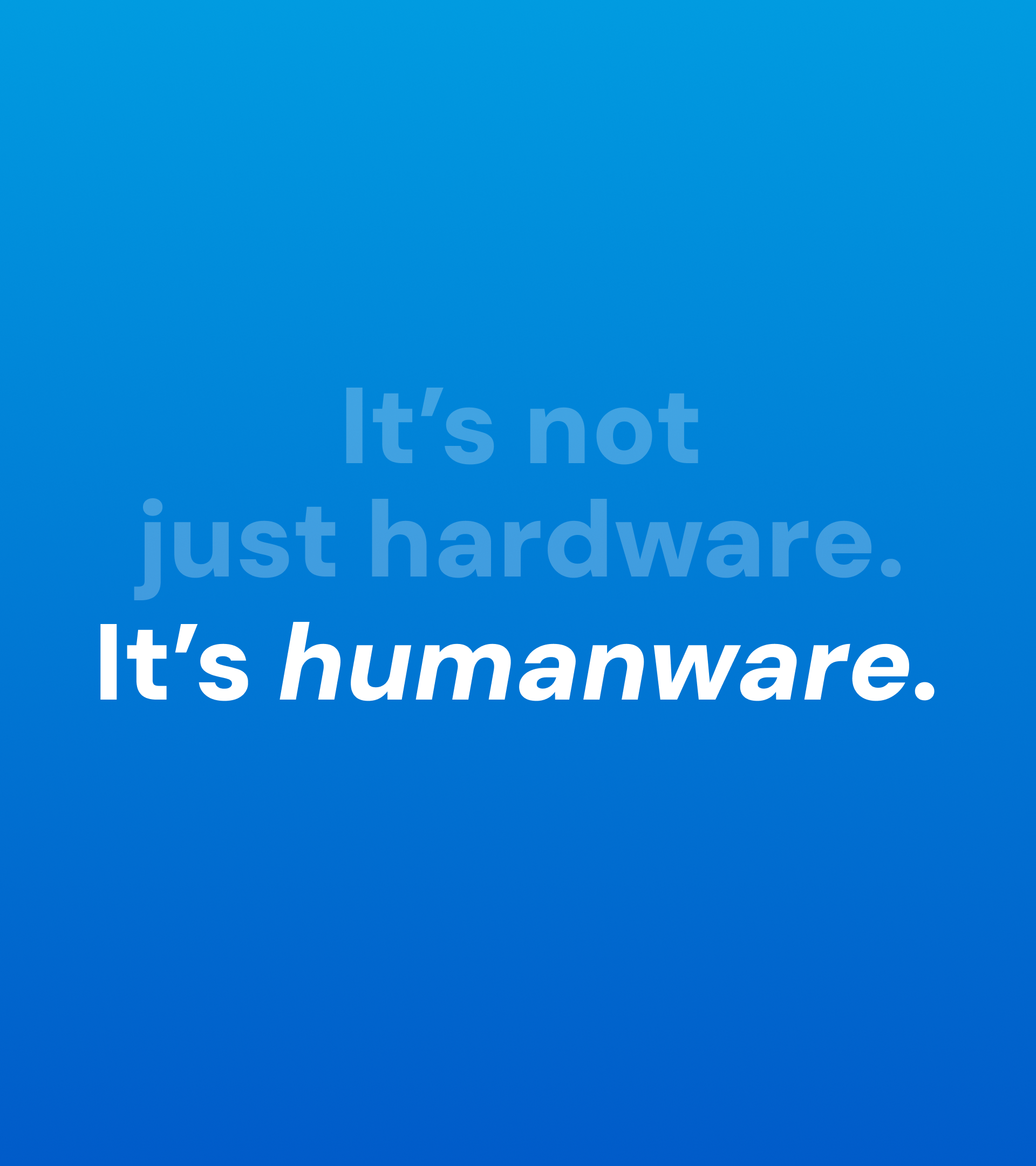
For a long time, the brand’s communication was dense and overly technical, often lacking a more human, accessible tone. The copy style was refined to match the brand’s repositioning: confident, clear, and quietly witty. It focuses on real performance and benefits, avoids hype, and speaks with authority without ever feeling loud or condescending.

Creating a signature element.
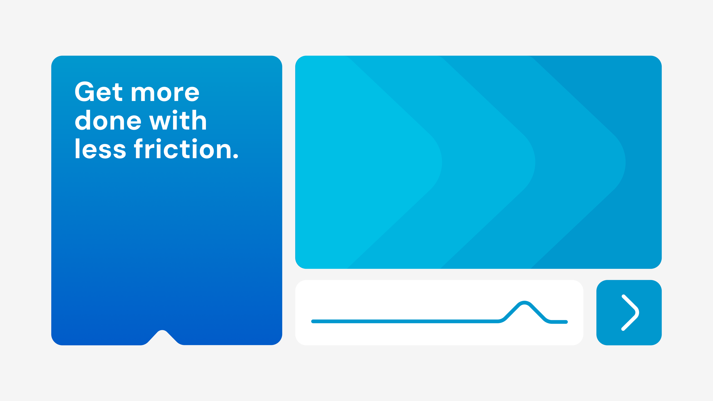
A signature visual element was developed based on the letter shapes of the existing logo. The idea came about while looking at the logo and thinking “What’s the brand’s most important value?”. And the answer is: continuous technological innovation. By abstracting the “R” form, I extracted a graphic element that symbolises forward movement, and can easily adapt in scale and composition. This element became the main driver of recognition across materials, while staying closely connected to the brand.
Expanded the colour palette for flexibility.
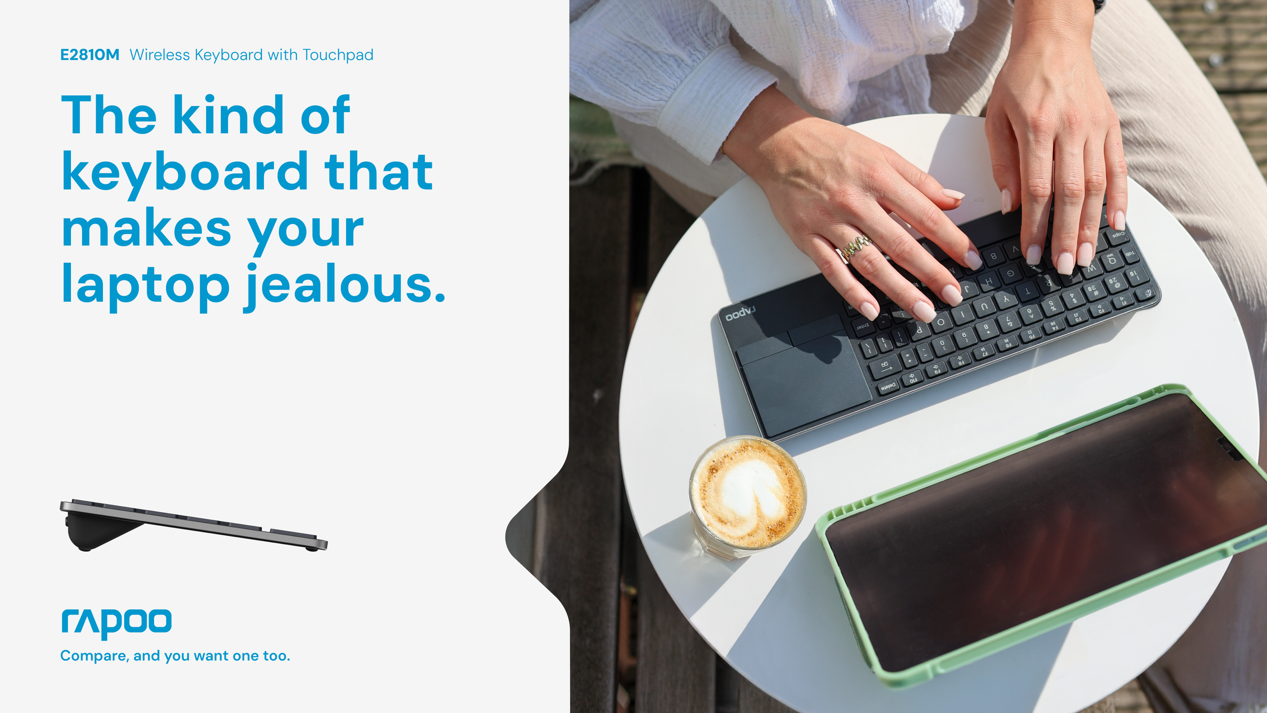
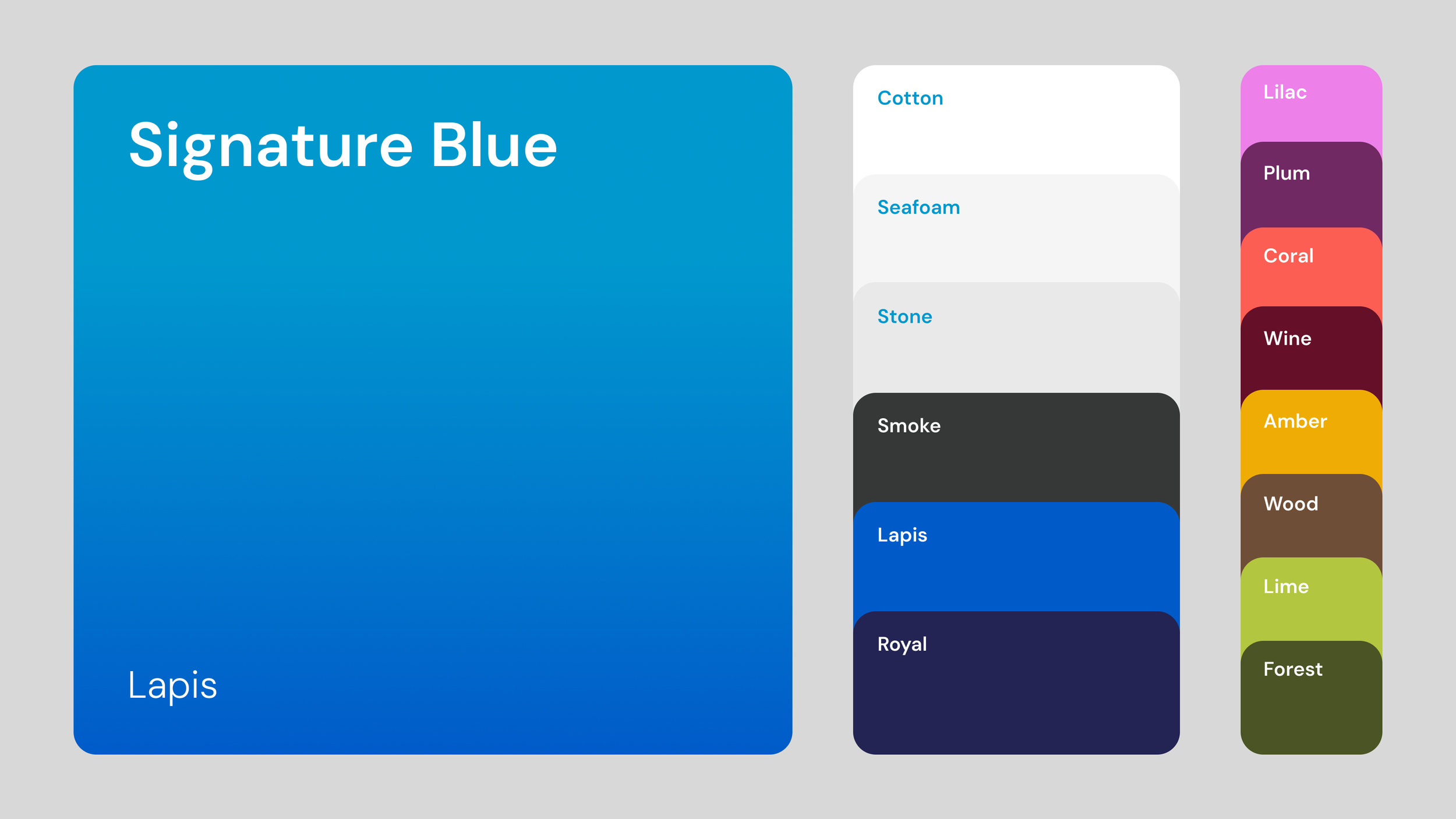
The colour system was expanded to bring more flexibility and depth to the identity while staying grounded in the existing brand palette. The core blue colour is accompanied by a concise collection of blues & neutrals, making it easier to create hierarchy inside compositions. A gradient version was introduced to add richness and movement, and a set of accent colours was created to support where needed.
Choosing a typeface that let’s the message shine.
The original typeface was distinctive but because of it’s “tech-ish” look, became outdated quite fast, and was often competing with the message. Introducing DM Sans allowed for more flexibility. It works across formats, and it’s easily accessible for all teams everywhere. Working with the typeface’s weight and size, we can create a variety of interesting compositions, allowing the brand’s voice to come through clearly and consistently.